Friday, November 30, 2012

The Hall Family Portraits

Rochester and Fairport family portraits - The Hall Siblings


One of my new favorite families called to have a family portrait done with their four kids over the Thanksgiving weekend.  This weekend is one of the busiest travel weekends of the whole year, and it also brings some of the most family portrait requests, because all the grown kids convene back in town to eat turkey, give thanks for what they have, and watch and argue over football.  The oldest of the kids in this family lives and works in NYC, two are in college, and the youngest is a senior in high school, and came through my studio once already this year for her senior portraits.  That's when I met and started really liking the Hall family.

Monday, July 9, 2012

From The Sports Desk...

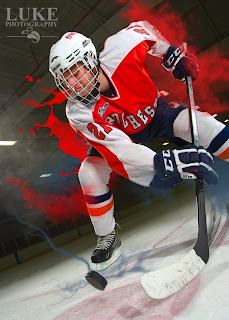
Numerous HS Senior athletes have come through the Luke Photography studio recently, and I look at each and every one of them as a challenge: how do I make them look like professional athletes, make them all look different, and make them look realistic, all at the same time?

I go into each session with an athlete with the idea that I'm creating a cover photo for a story in Sports Illustrated.  There has to be drama and impact on first sight....something to entice you into stopping to read the article.  Drama and impact are usually created by lighting.  Sometimes it's a different vantage point of the viewer...but most often it's the lighting.  Here are some examples of some HS senior athletes with impact.

Workin' up a sweat during the session
A puck's eye view of a face off
Blue turf and sky...amazing color.

Intensity shows in the eyes
An 8 ft. stepladder...on the ice.
Would you want to bat against him?


Old school basketball in an old school gymnasium

The red and blue create the impact...his look creates the drama


Team chemistry and intangibles...that's what leads to trophies

Yeah, you wish you could play like a girl
Can't argue with the great John Wooden.  She knows it

You can't mask dedication.....it always shines through


During games, her expressive eyes just radiate through this mask


Drama, impact and intensity....it's all here

All soccer...all the time

Friday, June 15, 2012

Fairport HS Senior - Ellie

Senior Pictures, Fairport HS, Rochester area, lacrosse

Ellie is the third of three ambassadors of Luke Photography at Fairport.  I was fortunate to hand-pick these three juniors from Fairport HS and I know that they are all athletic kids with great personalities from good families and they are well-liked.  It was difficult scheduling Ellie's session because not only was she busy six days a week with varsity lacrosse, but the SAT's and junior prom also fell at that time.  And beg as I tried, she wasn't willing to give up going to the prom to have her senior portrait session that afternoon.  That's a girl who has her priorities straight.

Ellie is one of those girls that is able to pull off a variety of good looks, from cute to sassy to athletically intimidating.  No matter what I suggested or what ideas I threw at her she responded well, which I guess she learned from her mother, who used to model occasionally for Kodak.  Good genetics shows.

Senior Pictures, Fairport HS, Rochester area, lacrosse


Senior Pictures, Fairport HS, Rochester area, lacrosseSenior Pictures, Fairport HS, Rochester area, lacrosse


Senior Pictures, Fairport HS, Rochester area, lacrosse

Senior Pictures, Fairport HS, Rochester area, lacrosse

Senior Pictures, Fairport HS, Rochester area, lacrosse


Thursday, May 17, 2012

Fairport HS Senior - Shawn


  This year I am working with three juniors at Fairport High School as ambassadors that will help spread the good word according to Luke Photography.  One of the ambassadors is Shawn who, as a junior, is a starter on three varsity sports in a school that graduates close to 500 students every year.  Let’s suffice it to say she is a good athlete.  Not only that, but she’s taking three AP classes.  It all adds up to one hell of a jock who is whip smart.

Here at Luke Photography, I take pride in the fact that I photograph each person to bring out their personality.  A lot of photographers claim to do that, but placing their subject in natural daylight up against a brick wall and taking their photograph says nothing about a person. At this studio, I actually interview the students before their session, so I can get an insight into what makes them tick.  During Shawn’s interview, it was obvious that sports have been a big part of their life, and they have been for a long time.

Shawn has this amazing red hair, and one of the best portraits from her session shows her in a bluish cardigan in front of a background that has streaks of cool blues, green and purples.  Warm and cool colors are complementary to each other, which means they are opposite each other on the color wheel.  When you place complementary colors (for example, red and green) next to each other in a painting or a photograph, they make each other seem brighter, more vibrant, and more intense.  This is the reason her hair and the background both “pop” in this image.

In addition to playing with the vibrant colors, I took advantage of her athletic nature for some great themed sports portraits in her soccer, basketball and lacrosse uniforms.  In the locker room image, I placed real metal locker doors into a hand-made frame and placed them on the right side of the background.  I placed a red gel over my background light, which is pointed at the left side of the background.  Then Shawn took her place on a makeshift locker room bench and played out a scenario that was meant to draw out a certain look.  An overhead light on Shawn and a little smoke from a smoke machine added a little drama to the image.

In the gymnasium image, Shawn was photographed against a white paper background, and a digital image of the old school gymnasium was added in post-production.  The warm, vibrant colors of her skin and her uniform stood out like a sore thumb against the muted colors of the background, so her color had to be adjusted to match that of the background in order to make it a believable image.  You don’t need to have taken AP courses to have seen that.  But Shawn would have picked it out in an instant.


Tuesday, May 8, 2012

Fairport HS Senior - Drew


Fairport Varsity boys soccer player Drew Cyher
Composite Portrait of Drew, a Fairport Varsity Soccer Player

Creating the Story of Someone in Photographs


Sometimes your job as a photographer is difficult.  Maybe your subject woke up on the wrong side of the bed…maybe they aren’t having a good hair day….maybe they just don’t want their portrait taken.  It’s days like those that truly make me appreciate the session I had recently with Drew, a junior from Fairport High School.  Not only is he easy-going, but has great looks, a great personality, and was actually looking forward to his session.  That is what we in the photography world call a “trifecta”.  I was the big winner that day.

Drew plays varsity and travel league soccer, and has been playing it forever, so the sport was going to be a big part of his session.  But there were plenty of other aspects of his personality to investigate.  He is planning on going into the ROTC program at his college of choice, Grove City, which is where is parents went and older brother is.  But I couldn’t get away from the soccer images.  I selected several images and created a composite that included several other elements.  Because sometimes just one or two (or three or four) images do not tell the story of a person.  Sometimes it takes many.


Drew will enter the ROTC Training Program at Grove City college
Drew brought his own flag for this patriotic-themed image
The monochromatic grey tones work well together in this color image


Soccer plays a big part in Drew's life, so we had to make it larger than life
This head shot is dominated by cool blue and grey colors


Tuesday, April 17, 2012

Open House - Luke Photography Studio

This past weekend was the official grand opening of the new Luke Photography studio.  While arranging for the catered food and shopping for supplies, I had visions of taking 98% of it home and eating cupcakes…delicious, alcohol-infused cupcakes…for weeks.  But we’ll get to that momentarily.  Don’t let me forget.

Over 250 postcard invitations were printed and mailed out to family, friends, existing and potential clients.  I also walked through the village near my studio and hand-delivered many more to other businesses that might benefit from cooperation with my studio.  I even lured people with the promise of out-of-this-world cupcakes made the W.C Fields way (“Candy is dandy, but liquor is quicker”).  The cupcakes were delivered an hour before the opening, and after tasting one, I didn’t care if anyone came…I could have eaten all of them.  Bailey’s Irish Cream in the icing, Jameson whisky in the ganache in the middle…do I need to say any more?

Customer Waiting Area
The first guest, a former client, was the first to arrive, promptly at 1pm.  It steadily picked up until a steady throng of people were coming and going for the next three hours.  My daughter and her friend were keeping a tally of the guests, and she happily told me at the end of the afternoon that the total number of guests more than doubled what I expected.  And they came bearing gifts of wine, champagne, flowers, house plants, and duct tape.  You have to know my nickname of "MacGyver" to appreciate the duct tape gift.

Main Shooting Bay and Head Shot Booth (behind column)
Many guests commented on the nice color scheme in the studio, from the waiting area to the vintage Hollywood changing room to the Preview Room, where guests get to see their images on a 7-ft. wide screen.  It’s a nice extension of our own home, where my wife and I collaborated on the whole color scheme of our home.  Many visitors to the studio mentioned that it is such a warm and inviting space…somewhere where they would feel comfortable right away.  And they liked the fact that each person that uses the dressing room gets their name on the door.

Daylight Shooting Bay
I think this is important for people that are coming in to have their portraits taken.  It gets them to let their guard down and be themselves, which is important.  I don’t want to take a photo of what people look like…anyone can do that.  I want to take make portraits of who people are, and you can only do that if they are comfortable with who you are, and where they are.  And if they don’t feel comfortable, then I could always duct tape them to the chair. I have a new roll...


Preview Room

Wednesday, March 14, 2012

Larson 4x6 Softbox Modification


If any of you have used the Larson 4x6 softbox, then you know how amazing the light is coming from the front of this beast.  Throw a monstrous light source in front of anyone or anything, and you can make them look amazing.

However, if you've used this beast, you also realize how big it is to use, and how much weight it can add to the front of your studio strobe.  I've only used it a couple of times, and it's already slipped off the front of my White Lightning studio strobes.  There is alot of weight cantilevered off the front of the strobe head.  I thought to myself: "Wouldn't it be nice if I could mount the soft box...the biggest, heaviest part of the whole apparatus...right on the light stand, then mount the light to it"?  Well, now I can.


After a quick trip to my home-away-from-home...some of you refer to it as Home Depot...I came a way with a very inexpensive solution.  Everything I needed was in Aisle 8 Plumbing, the official sponsor of MacGyver Corner here at Luke Photography.

Here are the ingredients to this recipe:

  •  1/2" galvanized floor flange
  • 1/2" to 1/4" galvanized bushing
  • 1/4' elbow
  • 1/4' x 2" steel pipe nipple

You'll also need 1/4" steel machine screws, lock washers and nuts to fit the floor flange to the softbox mounting plate.

Assemble the pipe components together as tightly as possible, then lay the assembly on the softbox mounting plate (disassemble the mounting plate from the softbox first) so you can determine where to drill the holes in the mounting plate.  When the holes are drilled, mount the new apparatus to the mounting plate using the screws, lock washers and nuts.


Re-assemble the softbox and mount it on the light stand.  Then mount the studio strobe into the mounting plate as normal.  The only thing left to add is a safety strap to keep the strobe from dislodging from the mounting plate if it gets bumped too hard.

Making this modification solves two issues:

  1. It brings the center of gravity of the light stand several inches closer to center of gravity of the softbox, making it more balanced.
  2. It takes most of the stress off the spring-loaded mounting clips on the front of the strobe, thereby prolonging it's life. 

It also opens up the possibility of mounting any strobe....think Quantum or any hotshoe flash...in this huge softbox.  For all you Strobist fans, did you ever think you'd be able to throw a 4x6 softbox on a Nikon SB speedlight?

It only took about $7 in parts and 15 minutes...and now I can make anyone look amazing....safely.

Saturday, February 25, 2012

The Birth of a Photography Studio


After 3 weeks of blood, sweat and a few tears, the new Luke Photography studio is nearing a point where it will be ready for occupation.  And unlike the Occupy “Insert City Here” movement that has fizzled out in various cities across the country, this one is here for the long haul.
The changing room has been built and is awaiting the finishing touches.  The wall along the north-facing windows has been extended, so that standard-width backgrounds can be hung from it, to take advantage of the natural light from the windows.  The floor has been installed in the shooting areas.  And most of the painting has been done.  The waiting area was finished off with a new couch and coffee table, and will be receiving new prints for the walls and some comfortable décor touches.

Next week, the changing room will be finished in a vintage Hollywood theme.  The work island in my office will be completed and stocked.  And finally, the sales room will be readied for the final touches.  Next weekend, furniture from the current studio and office will be moved in, and all the photography equipment will be following shortly after.

A new friend that I met in New Orleans sent me a congratulatory greeting card that contained a Home Depot gift card and several band aids.  The band aids have been used up, as has the gift card, which was used to help pay for the wood for the cabinets in the work isalnd.  There will a storage cubbie in my work island that will be forever known as the “Slye Spot” as a thank you to Kiera for her thoughtful gift.


As I told one of my new building neighbors: the good thing is that I can do all this renovation work.  The bad thing is….I can do all this renovation work.  Most of the heavy work has been done.  Now onto the finish carpentry, which will require fewer band aids, and a lot less sweat.  Then I can sit back and start the work that I was meant to do: create great photographs.


Wednesday, February 15, 2012

Watching Paint Dry...Nauseously

On and off for two weeks I‘ve been spending time painting several of the walls in my new studio.  Because I still have jobs to shoot and orders to fulfill, I can’t spend all my time there getting things ready.  So I pick and choose the days I can get there and try to make the most of the time that I do spend there.  Which makes me all that much crazier when I feel like I’ve wasted time.

I was planning on the walls in my waiting area reflect the nice warm, inviting, chocolately brown that is prominent in my logo and web site and is consistent with my branding.  As such, I proceeded down to the local Home Depot paint aisle and picked out a fantastic shade of paint called “Shaved Chocolate”.  Now….seeing that there was the name “chocolate” in the title of this latex-infused pigmented wonder, you’d assume that the resulting painted wall would be a reasonable facsimilie of a chocolate-like color.  I don’t know what corner of the world you are reading this from, but I have to assume if we all picked out a color that resembled chocolate, we’d all be pretty close.

As I watched the paint dry, I prayed to the God of Sherwin Williams that the color of the wall would indeed look better as it dried. Boy was I mistaken.  For what to my wondering eyes should appear, but a color that was not Shaved Chocolate.  If I had to describe it to my friends….and I did…it was Infant Diarrhea Brown.  Now, for those of you without kids…Infant Diarrhea Brown would never be mistaken for Shaved Chocolate.  No matter how late in the night the Infant Diarrhea Brown presented itself and no matter how badly you pleaded with your wife that it was ‘her turn’.

After assessing the situation, I knew that not only would my customers not like it, but it may cause many of the younger parents to rush out screaming with Post-Traumatic Stress Disorder.  One of the great things about paint aisles in big box stores is that they will often take back custom mixed paint that didn’t quite set the buyer’s world on fire.  Over a year ago I purchased a gallon of one such paint.  It was dark brown paint that I plucked from the Shelf of Mis-Fit Paints for $5, knowing that I could use it to paint backgrounds for my studio, or somewhere else.  I precisely mixed in 14 Dixie cups full of this dark brown paint into what was left of my Infant Diarrhea Brown paint, magically transforming it into….Shaved Chocolate.

As I happily covered all evidence of the…let’s say it together…Infant Diarrhea Brown, I was pleasantly surprised at how perfect the color was.   So I watched it dry.  Just to be sure that it stayed perfect.  And it did.  And now I can move on to another area of the studio, with the knowledge that I need to stay away from colors that resemble anything you might find in a diaper or regurgitated on a bib.  That being said, I may have to rethink the choice of Split Pea Soup in the sales room.

Monday, February 13, 2012

The End of a Kodak Era


This week Kodak announced that it was getting out of the camera business in order to save money.  No, that’s not a typo.  The company that brought photography to the masses in 1884 is exiting the business.

Kodak did not invent the camera.  Cameras were around for decades before.  In fact, the first known photograph dates back to 1825.  For the next 60 years, large box cameras were used to expose light onto glass or metal plates that were coated with light-sensitive materials, making it a very time intensive and laborious process.  Taking photographs often involved a strong-willed photographer, a couple of Sherpas, and a mule train to carry all the equipment.

What George Eastman did when he patented roll film in 1885 was to make it easier for everyday people to take photographs, without Sherpas or mule teams.  He coined the phrase “YouPush the Button, We Do the Rest”, which described the process by which a camera owner would send the whole camera back to Kodak when the roll was completely shot, and Kodak would process the film, make prints, and load film back in the camera, which it would then return to the owner.

Kodak started making cameras in 1891, introduced the No.2 Brownie in 1903 (which basically invented the photography enthusiast), and invented the first digital camera by Steve Sasson in 1975.

Fast-forward all the way to 1999, when I worked in Kodak Professional, testing the DCS professional digital cameras.  Kodak would buy camera bodies from Canon and Nikon and strip out all the film parts and replace them with all the digital components.  Half the Canon cameras would have a Kodak logo on them and were sold by Kodak, and half got the Canon logo and were sold by Canon.  Likewise with the Nikon cameras.

These cameras were the best digital cameras in the world.  I remember watching events like the Super Bowl, and noticed that at least 90% of the photographers on the sidelines were using Kodak cameras.  Only a photography geek would notice that, although I apologize to no one for that.  The cameras were also used by photojournalists all over the world, who happily used the amazing 2-megapixel cameras and could send photos all over the world…within hours…not days as with film.  We laugh at that now...but at the time, they were the cat's pajamas.

I also worked on the DCS Pro Back system, which was a 16-megapixel back that would fit on a medium format camera.  The camera back was amazing, but at $10,000, you weren’t expecting to sell a lot of them.  I felt very fortunate to be able to use that system, knowing that it was going to go into the hands of the best commercial photographers in the world.

In 2001 or 2002, Nikon introduced their own digital SLR camera.  Although it didn’t have all the bells and whistles, it was priced at about half of what the Kodak cameras were selling for.  I remember it being really quiet around the Kodak offices for almost a week.  As other camera manufacturers came up to speed on digital technology, other cameras came to market.  None of them had the quality of the Kodak digital SLRs, but they were good enough for the common man.  Sales of the Kodak cameras dropped, and Kodak Professional stopped making professional digital SLRs in 2005.  And this week, the announcement came that consumer cameras would no longer be made.

It is the end of an era.  I have a collection of old Kodak cameras, some dating back to the 1920s.  As a Rochester resident, the home of Kodak, we lived and breathed Kodak cameras our whole lives….for the better part of 120 years.  Until this week.  Now we get to witness Kodak moving off in another direction.